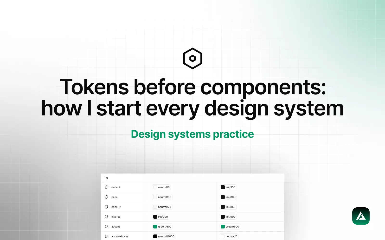

GliaKit is one design system that lives in two places: a free Figma UI kit and a paid Next.js + shadcn boilerplate, with AI rules files so Cursor and Claude Code build on it instead of around it. This is the build log. What the Figma side is made of, how it maps to code, what I got wrong in version one, and what version two changed.
Why a design system for AI products at all
AI coding tools ship features. They do not ship taste. Prompt a dashboard and you get working code with default fonts, arbitrary spacing, and a blue button that matches nothing else on the page. Every screen drifts a little further from the last, and by week three the product looks like four different people built it, because in a sense they did.
The fix is not a prettier prompt. It is a system the code already follows: tokens the AI can reference, components it can import, and a rules file that tells it which to use. That is the whole product idea, and it decided every technical choice below.
1. Figma variables, three layers
The Figma side follows the same order I use for client systems, tokens before components. Four collections do the work:
- Color / Primitives. The raw palette: a violet ramp for the brand, a neutral ramp, and the status colors. Twenty-two values, single mode, hidden from pickers so nobody binds a component to a raw hex.
- Color / Semantic. Fourteen job-named tokens in two modes, Light and Dark, each aliased to a primitive:
bg-canvas,bg-surface,text-primary,text-muted,border,accent,accent-fg, and so on. Switching a frame to Dark remaps every one of them. No second palette, no duplicated components. - Spacing and Radius. Thirteen spacing steps and six radii, each scoped so spacing only appears in gap and padding pickers and radius only in corner pickers.
- Type and effects. Ten text styles from display down to code, Inter plus JetBrains Mono, and three shadow levels.
Every variable carries a code syntax entry, so Dev Mode shows var(--color-bg-canvas) instead of a hex. That one setting is what makes the handoff section below short.
2. The 1:1 Tailwind map
The rule is simple and strict: a token has one name, and it is the same name in Figma, in CSS custom properties, and in the Tailwind config. bg-surface in Figma is --color-bg-surface in CSS and bg-surface as a Tailwind class. No translation table, no "Figma calls it X, code calls it Y" document that goes stale in a month.
Getting there forced a naming decision. My client systems use nested names like surface/raised, which read well in the Figma variables panel. Tailwind wants flat, hyphenated names. GliaKit went flat everywhere, because the code is the consumer that cannot adapt, and a designer can live with bg-surface.
3. shadcn components, composed never redrawn
The code side is shadcn/ui, which means components are owned source files in the repo, not a dependency. The Figma components mirror them one to one: same names, same variants, same prop vocabulary. Button has variant and size in both places, and the values match, including GliaKit's own gradient variant that the rules file tells the AI to use for primary calls to action.
Fifteen screens ship in the kit: dashboard, billing, settings, auth, onboarding, and the AI patterns most kits skip, chat, streaming responses, agent steps, tool calls, and model selection. Every one of them is assembled from the same base primitives. Nothing is redrawn. Change the radius token and all fifteen screens update, in Figma and in the running app.
The test
If a screen needs a shape that is not a component instance, the system is missing a component, not the screen. I add the component, then build the screen. It is slower for the first three screens and faster for every screen after.
4. Light and dark as one mapping
Dark mode is not a second theme. It is the same fourteen semantic names pointed at different primitives. In Figma that is a mode on the semantic collection. In code it is one CSS class on the root that swaps the custom property values. Components never know which mode they are in, which is the only way dark mode stays free as the system grows.
The one place this needed care was translucency. Overlays, glass panels, and the signature gradient on hover use alpha. Figma bound paints cannot carry opacity, so those few values live as alpha primitives, white-alpha-12 and friends, rather than as opacity on a solid token. Same names in code.
5. Accessibility built into the tokens
Contrast is checked at the token level, not per screen. Every text token against every surface token it is allowed to sit on passes AA in both modes, and that matrix is small enough to check by hand: four text roles, four surfaces, two modes. Focus rings use the accent token with a two-pixel offset in both Figma and code. Interactive targets have a 44px minimum, which is the size variant default on buttons and inputs. Doing this once in the tokens means no screen can quietly ship a grey-on-grey placeholder.
6. Developer handoff that is mostly not needed
Because names match, handoff is reading, not translating. A developer opens a GliaKit screen in Dev Mode and sees bg-surface, space-4, radius-md, and a component named Card with the same variants as card.tsx. The boilerplate has the component already. The screen is a composition exercise.
The AI rules files are the handoff for the other developer on the team, the one that writes code at 2am. .cursor/rules/design-system.mdc and the Claude Code equivalent say three things: never hard-code colors, use semantic tokens only; use these component names with these variants; here are the radius and spacing scales. With that in context, a prompt for a new settings page comes back using the existing Card, Button variant="gradient", and text-muted-foreground, not a fresh invention.
What v1 got wrong
Version one shipped under a different name, Synapse, and taught me three things the hard way.
- It started with components. The first pass drew screens, then tried to extract tokens from them. Forty shades of grey, two slightly different buttons, and a dark mode that needed its own component variants. I threw it away and rebuilt tokens first. The second build took less time than the first.
- It over-scoped. Early plans had three themes and a density switch. Nobody buying a kit needs that on day one. V1 was cut to one polished theme in light and dark, and the kit got better by getting smaller.
- It baked text into images. The cover and the marketing mockups were rasters with the product name painted in. When the name changed, every variable, component, and line of code renamed in an afternoon, and the images took longer than all of it. Anything that can be a text layer is a text layer now.
What v2 changed
- The rename to GliaKit, with identifiers, package names, Figma text, and the Community listing all moved together.
- Flat token names across Figma and code, replacing the nested names that needed a translation step.
- The AI rules files and prompt library as a first-class part of the product, not a readme footnote. In practice this is the feature people email about.
- The wired boilerplate: auth, payments, database, and email connected on day one, so the design system arrives inside a running product instead of beside one.
- The split into free and paid. The Figma kit is free on Community so it gets duplicated and discovered. The boilerplate is paid. The value was never the components, it is the parity between the two.
Get the Figma file
The design system is free: duplicate GliaKit on Figma Community and you get the variables, text styles, components, and all fifteen screens in both modes. The Next.js boilerplate, docs, and AI rules are at gliakit.com, and the shorter version of this story is the GliaKit case study.
If you want this structure for your own product rather than a kit, that is what my design systems service is: the same token order, the same 1:1 map, built around your brand and your stack.