
Planeron
A booking and scheduling SaaS for service businesses - clinics, beauty and wellness, fitness studios, and consultants. I designed Planeron from scratch: the brand identity, the conversion-focused landing page, and the full product, from capacity-aware calendars to a two-sided booking experience.
Bookings handled, so businesses can work
Planeron's promise is simple: "We take care of bookings. You take care of business." Under that simple line sits a genuinely hard scheduling problem - capacity-based services, staff rotations, group classes, multiple locations, and payments, all coordinated without double-booking anyone. The product serves two audiences at once: businesses managing their schedule, and their clients booking in a few taps.
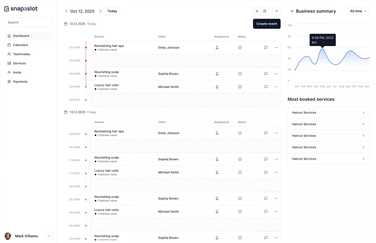
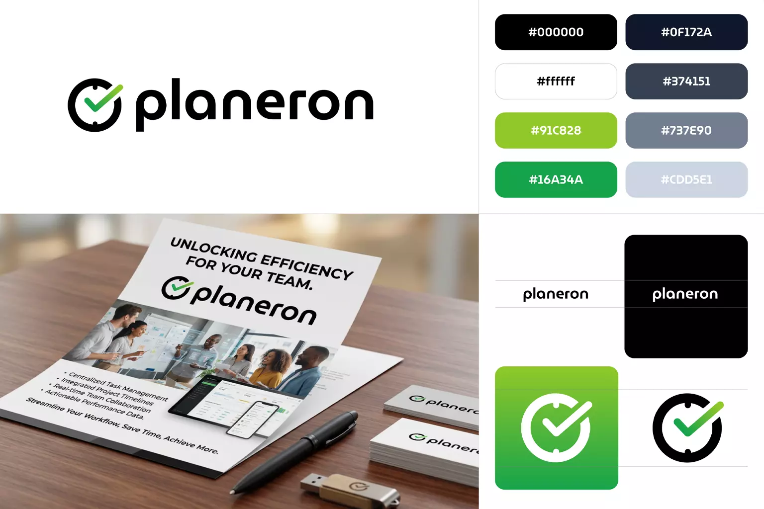
An identity built on calm reliability
Scheduling tools sell trust: a missed booking is lost revenue. The identity I designed leans into that - a clean wordmark with a circular clock-inspired mark, a restrained palette of deep charcoal on white with a single confident green accent, and generous whitespace throughout. The brand had to feel dependable to a clinic and approachable to a nail salon at the same time, in light and dark mode alike.
One page, two audiences
The landing page has to convert two different visitors: a business owner evaluating yet another scheduling tool, and a client who just wants to book an appointment. The hero splits them immediately - "I'm a business" vs "I want to book" - then walks owners through a three-step setup story: customize your link, share it anywhere, and watch the schedule fill itself. A feature comparison table and FAQ handle the "why not the others?" objection head-on.
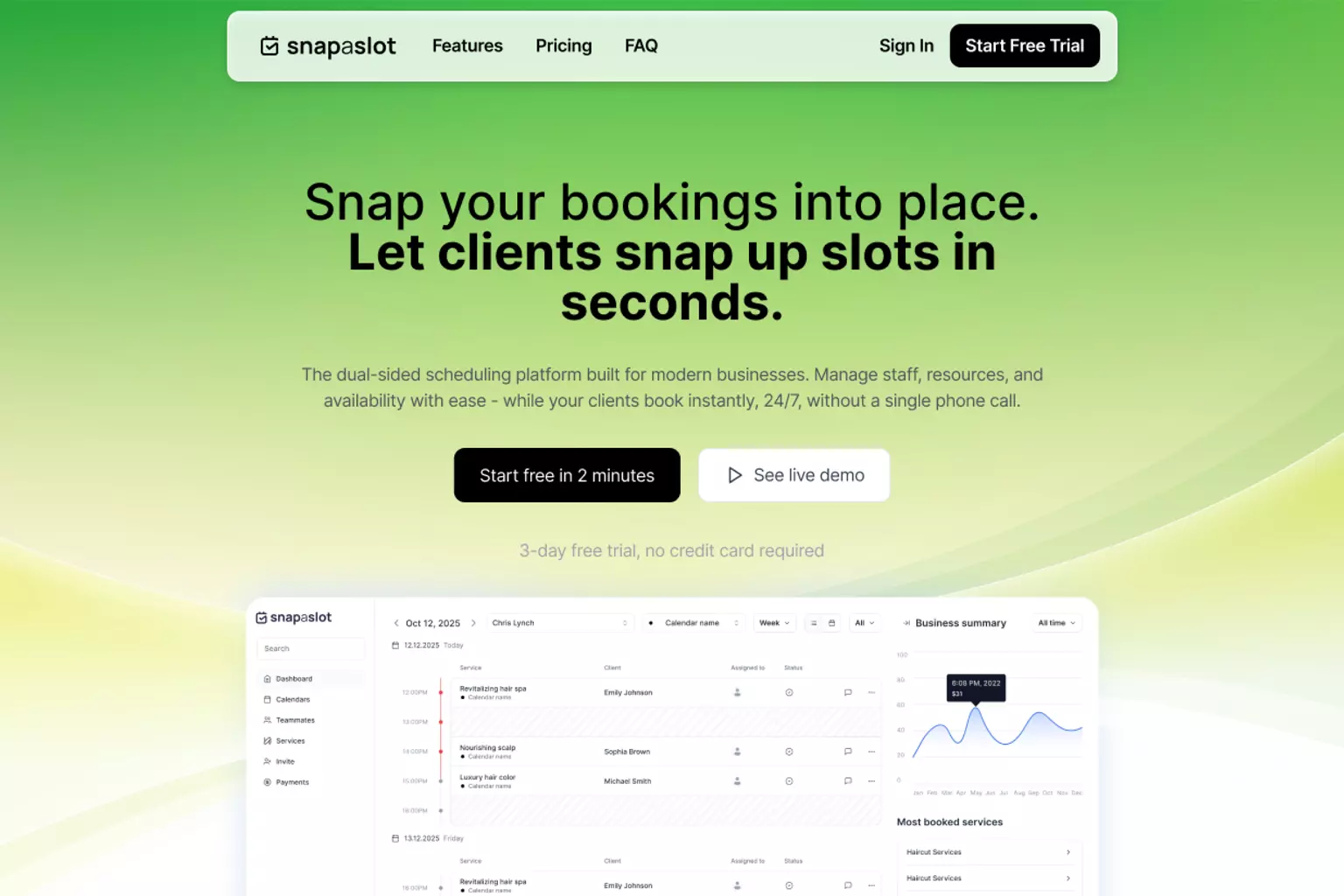
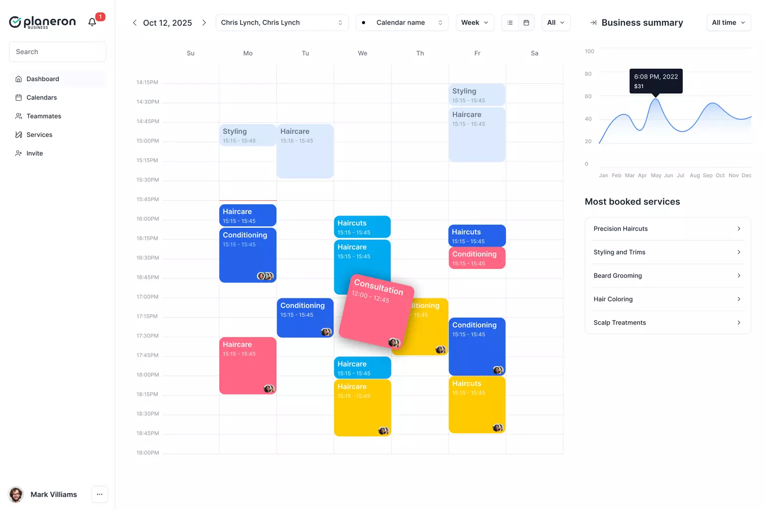
Complex scheduling, simple screens
The core design challenge was the calendar: capacity modes, multiple shifts per day, break times, overlap protection, and round-robin staff assignment all live in one view without overwhelming the person running a busy front desk. I designed the booking flows, multi-location calendar, team and resource management, reminders, and payment screens as one consistent system - every rule the business sets is visible and editable where it applies, not buried in settings.
Building a SaaS product from scratch?
Book a free 20-30 minute call to discuss your branding, landing page, or product design.