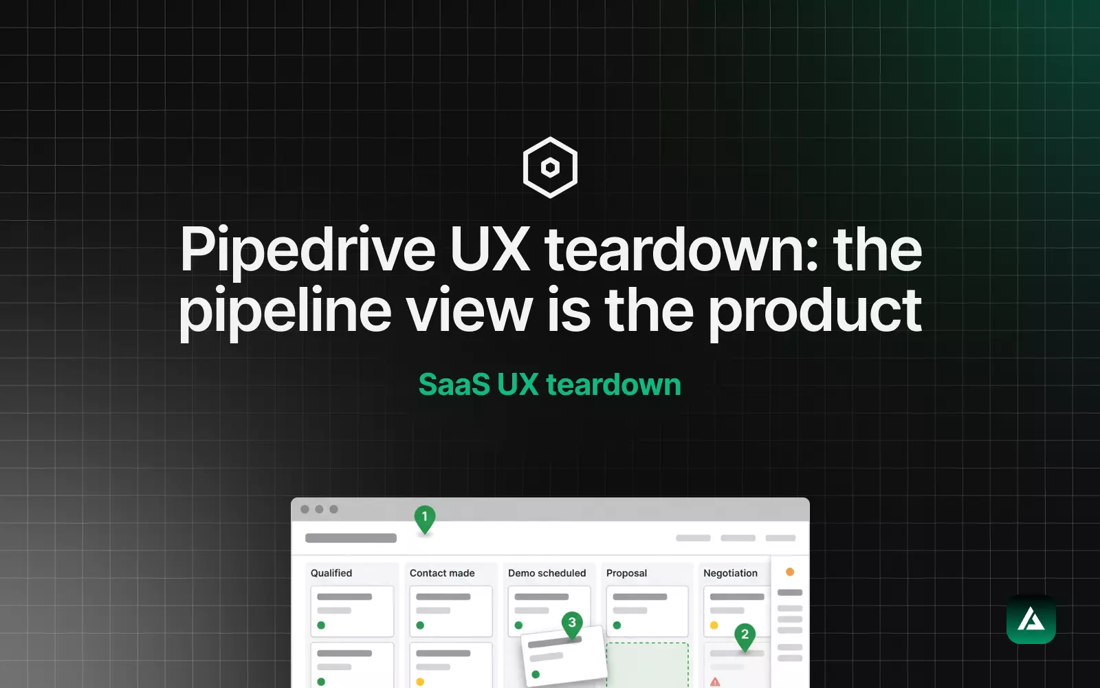
Client audits are confidential, so this sample uses a product anyone can try: Pipedrive, the sales CRM. It is an excerpt in the same format as a full report. You get the summary, the fix-first list, four findings, what to keep and the roadmap. Each finding names the screen, the problem, the evidence, a severity, the effort and the fix. A full audit runs to 30 to 40 pages and 50 or more findings, with your analytics and session recordings behind them.
About this sample
Independent review, no affiliation with Pipedrive. It is based on a trial account in August 2026, the same review behind my Pipedrive UX teardown. Without access to Pipedrive's analytics, the evidence here is what I observed. In a client audit, every finding also carries the numbers from your funnel and recordings.
Report details
| Product | Pipedrive, a pipeline-first sales CRM (web app) |
| Scope | The pipeline view, filters and saved views, the deal page, settings and the main navigation |
| Method | Heuristic review and task walkthroughs as a new sales rep in a trial account |
| Date | August 2026 |
| This excerpt | 4 findings, the fix-first list, what to keep and the roadmap |
Summary
Pipedrive's core is excellent. The pipeline is the home screen, the most common action costs almost nothing, and the product nudges reps to always have a next step. The problems sit around that core. The most powerful feature of the pipeline is the hardest to find, the deal page does not agree with the card about what matters, and settings and navigation grew by addition rather than design. None of the fixes needs a redesign of the pipeline itself.
Fix first
In a full report this list holds the top five, ranked by likely impact on activation and retention against the effort to ship. Severity describes what users go through; the order also weighs effort, which is why a minor fix that takes a day can come first. From this excerpt:
- Promote saved views to tabs above the pipeline. Minor, effort S. The cheapest retention win on the board.
- Give the deal page a fixed next-step header. Major, effort M. It makes the daily screen agree with the card.
- Add a guided settings map. Minor, effort M. Same screens, a new front door.
The severity scale
| Blocker | Users cannot complete the task. |
| Major | Most users struggle or give up. |
| Minor | It slows people down, but they get through. |
| Polish | Consistency and craft. |
Effort is S, M or L: about a day, about a week, or more than a sprint for a typical product team. Together they let your team pick the high-impact, low-effort fixes first.
Findings
Finding 1. Saved views are hard to find
| Screen | Pipeline view, filter control |
| Problem | Filters can be saved as views, such as my deals this quarter over 10k, and pinned. New users work one default view for weeks before they find out. |
| Evidence | Walkthrough as a new rep: saved views live behind a small control styled like a secondary option. The most powerful feature of the main screen is the least discoverable one. |
| Severity | Minor |
| Effort | S |
| Fix | Show saved views as tabs above the pipeline: My deals, Team and the user's own views, visible by default. The feature already exists; this changes where it lives. |
With your analytics: the share of weekly active users with at least one saved view, and how long after sign-up they create the first one.
Finding 2. The deal page does not lead with the next step
| Screen | Deal detail page |
| Problem | Contacts, activities, notes, emails, files, products and history share one long, dense page. The hierarchy is flat, so the next scheduled activity does not outrank a file attached three months ago. |
| Evidence | The deal card on the pipeline already leads with the status of the next activity. The detail page, where reps spend their time on a deal, does not give it the same weight. |
| Severity | Major |
| Effort | M |
| Fix | Pin a next-step header to the top of the deal page: value, stage, owner and the next scheduled activity, with the long feed below it. |
With your analytics: the time from opening a deal to scheduling or completing an activity, and the share of open deals with no next step.
Finding 3. Settings read like a filing cabinet
| Screen | Settings |
| Problem | Custom fields, pipelines, automations, permissions and integrations have accumulated into one area organised by object. Each screen works; the whole is hard to navigate. |
| Evidence | Deciding how deals move touches pipelines, custom fields and automations, which sit in separate sections organised by object rather than by the job an admin is doing. |
| Severity | Minor |
| Effort | M |
| Fix | Add a guided settings map: a wayfinding layer that groups settings by job, such as set up how deals move and set up who sees what. Same screens, new front door. |
With your analytics: settings search terms, support tickets tagged as setup, and how many admins finish the core setup in their first week.
Finding 4. The navigation tells a different story from the home screen
| Screen | Main navigation |
| Problem | Leads inbox, Deals, Projects, Campaigns, Products, Insights and more sit side by side. Each made commercial sense; together they dilute the pipeline-first story the home screen tells so well. |
| Evidence | A new user sees a general-purpose suite on day one, before the pipeline has earned their trust. |
| Severity | Minor |
| Effort | L |
| Fix | Lead new accounts with Deals and Leads, and let each team switch on the other modules when it needs them. This touches plans and permissions, so it belongs on the roadmap, not in the first sprint. |
With your analytics: module usage by role and by account age, to see which modules a new team actually opens in its first month.
What to keep
An audit also lists what not to break. These are the reasons the product works, and every fix above is designed around them.
| Pipeline as the home screen | It opens on the work, not on a dashboard, and answers what is moving and what is stuck without a click. |
| Activity nudges | Deals with no next step get a warning, and stale deals look visibly unwell. Behavioural design with restraint. |
| Drag and drop | Moving a deal is fast and reversible, and the won or lost decision happens inline instead of in a form. |
| Quick add | Reps can capture a deal from anywhere without leaving what they are doing. |
Roadmap
The roadmap turns the findings into an order of work your team can drop into Linear or Notion.
| When | Change | Finding | Effort |
|---|---|---|---|
| Quick wins | Saved views as tabs above the pipeline | 1 | S |
| Next sprint | Next-step header on the deal page | 2 | M |
| Next sprint | Guided settings map | 3 | M |
| Next quarter | Modules switched on by team | 4 | L |
What a client audit adds
This sample shows the format. An audit of your own product goes further:
- Your data on every finding. Funnel numbers from Mixpanel, Amplitude or Hotjar, and clips from session recordings, so each severity is backed by evidence.
- 50 or more findings. Across onboarding, the core flows, settings, accessibility and design system health. My SaaS UX audit checklist shows everything I check.
- Figma fixes for the top issues. High-fidelity redesigns of the findings at the top of the fix-first list, ready for your developers.
- A recorded walkthrough and a live session. I walk your team through the findings and help you decide what to ship first.
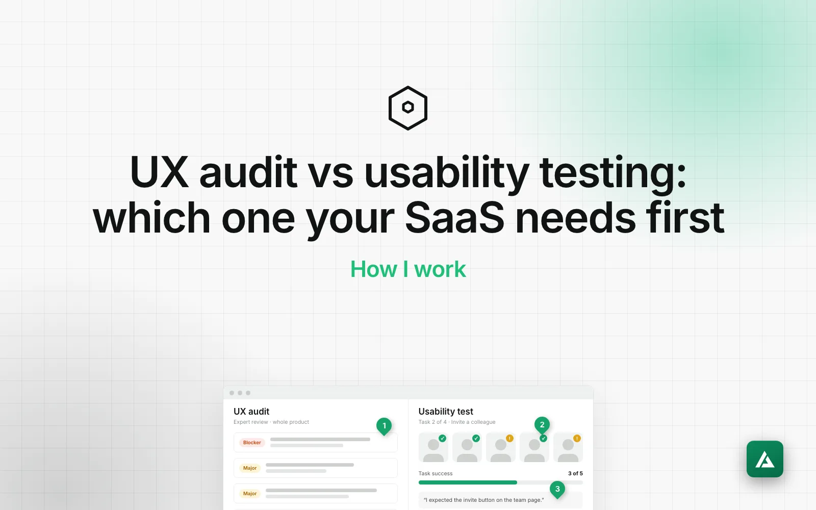
The whole audit takes 7 to 10 business days. If you are not sure an audit is the right first step, UX audit vs usability testing compares the two.
Questions about the report
What does a UX audit report include?
A summary, the fix-first list, every finding with the screen, the problem, the evidence, a severity, the effort and the fix, a list of what to keep, and a roadmap. Figma fixes for the top issues and a recorded walkthrough come with it.
How long is a full report?
Usually 30 to 40 pages with 50 or more findings, delivered 7 to 10 business days after I get access.
Why is the sample on Pipedrive and not a client?
Client audits are confidential. Pipedrive is a public product with a free trial, so you can check every finding here yourself.
What do you need from me for an audit?
Access to your product, ideally a staging environment, your analytics, and a short overview of your goals and the flows that matter most.
If you want this for your own product, my SaaS UX audit starts with a free call to agree the scope.