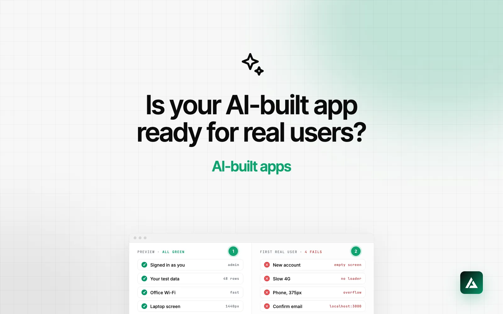
The app works in the preview. You are signed in, your test data is there, the Wi-Fi is fast, the screen is wide, and you know what every button does. Your first real user has none of that. Most production-ready checklists for vibe-coded apps cover the engineering, and you need that half. This one covers the half they skip: what users see and touch. It is the list I run in the first hour of a cleanup, and you can run it yourself in an afternoon.
Production ready has two halves
The engineering half is authentication, database permissions, API keys, payments, backups and monitoring. In 2025 a vulnerability was published for Lovable-generated apps whose database tables had no row-level security policies, which let people who were not even signed in read or write their data (CVE-2025-48757). Before launch, have a developer check the permissions on every table, which keys ship to the browser, and the payment webhooks.
The other half decides whether people stay long enough for any of that to matter. I am a designer, so the rest of this post is about the screens. Each group below is one thing the preview hides.
How to run it
You need a new email address, a phone, Chrome and about three hours. Sign up the way a stranger would, from your landing page, not from the admin account you built with. Mark each check pass or fail, and give every fail one of three labels: it blocks the user, it costs trust, or it just looks off. Fix the blockers before launch and the rest in the first two weeks.
If you only have an hour
- Sign up with a new email, on your phone (checks 1 and 14).
- Open the confirmation email on that phone and click the link (checks 21 and 22).
- Look at every empty screen the new account sees (check 2).
- Submit the sign-up form empty, then with an email that is already registered (check 5).
- Do the core task once on a slow connection (check 10).
1. The preview has your data
Your account has projects, settings and history. A new account has nothing, and an empty app is where most AI-built products lose people.
- Sign up with a new email. Admin roles, feature flags and seeded rows on your own account hide problems a new user will hit.
- Every empty screen has a job. Each list, dashboard and chart with no data says what will appear there and offers one action to fill it. Generated empty states are usually a grey line of text, or nothing at all.
- Count the steps to first value. From the sign-up button to the first moment the product does something useful for this person. Every step that does not serve that moment can wait until after it.
- The product makes sense with no data. If it needs data to make sense, offer sample data, a template or an import, so the first screen is not an empty grid.
2. The preview has your typing
You know which format each field wants. Your users will guess, paste, mistype and press the button twice.
- Submit every form empty, then wrong. Errors appear next to the field that caused them, in a sentence a person wrote. "Duplicate key value violates unique constraint" is your database talking to your customer.
- Double-click every submit button. You should get one record, not two. The button shows that it is working and ignores the second click.
- Nothing typed is lost. A failed save, a validation error or an accidental swipe back should not empty a long form.
- Fields help the phone and the password manager. Email fields bring up the email keyboard, number fields bring up the number pad, and sign-up and sign-in fields carry the
autocompletevalues that let password managers fill and save them. - Destructive actions ask first. Deleting a project asks for confirmation or offers an undo, and says what will be lost with it.
3. The preview has your Wi-Fi
Generated code tends to assume that every request is instant and succeeds.
- Throttle the network. In Chrome DevTools, set the Network panel to Slow 4G and use the app. Every action that waits should show that it is waiting, and lists should show a skeleton instead of jumping into place.
- Go offline in the middle of a save. The app should say the save failed and what to do next, not spin forever or clear the form as if it worked.
- Make the data big. A 60-character name, a 400-word description, 500 rows in a table. Text wraps or truncates with the full value still reachable, and long lists paginate.
- Reload a deep page, then open it in a private window. A reload should land on the same screen. A signed-out visitor following a shared link should land on sign-in, and then on the screen they were sent to, not the dashboard.
4. The preview has your screen
Most AI-built apps are built on a laptop, where the phone preview is a toggle you rarely press.
- Open every screen at 375 pixels wide. Tables, sidebars and modals break first. A table that scrolls sideways inside a page that also scrolls sideways is the classic.
- Tap targets are big enough. Apple's guidelines ask for at least 44 by 44 points. Icon buttons in table rows and the close button on modals are the usual offenders.
- The keyboard does not hide the button. Fill in each form on a real phone. The submit button and the error messages stay reachable with the keyboard open, and long modals scroll.
5. The preview has your mouse
Some of your users move through the page with a keyboard or listen to it through a screen reader, and many more will read your grey text in sunlight.
- Tab through sign-up and the core flow. You can reach every control, the focus is visible at every step, and the order follows the screen. shadcn/ui components are built on Radix and handle much of this for you. Custom components generated around them, such as a clickable
div, usually do not. - Text contrast meets 4.5:1. That is the WCAG AA level for body text. Light grey helper text and placeholders on white are the common failure.
- Icon-only buttons have names. A screen reader should announce "Delete invoice", not "button". Images that carry meaning have alt text.
- Run Lighthouse on the main screens. The accessibility score is a floor, not proof, but a score under 90 means there are cheap fixes waiting.
6. The preview never sends a real email
This is the group that breaks launches. Sign-up works perfectly for you, and nobody else ever receives a confirmation.
- Use a real email sender. Many Lovable and Bolt apps sign users in through Supabase. Its built-in email service only delivers to members of your own Supabase team and sends a few emails an hour, and Supabase asks live apps to move to their own provider. Set up custom SMTP on your own domain before launch.
- Click every link in every email, on your phone. Confirmation, magic link, password reset and invite. Supabase's Site URL defaults to localhost:3000, and if nobody changed it, those links send real users to a page that does not exist.
- The emails look like yours. Your product name as the sender, your logo, a clear subject line and one button.
7. The preview has no strangers
A stranger decides in seconds whether to trust you with an email address, and later with a card. These are the details they judge you by.
- The browser tab is yours. The page title, the favicon and the preview image that appears when someone shares a link. A template default in any of the three is the first thing people notice.
- The app lives on your domain. Not a subdomain of the tool you built it with. A domain costs a few dollars a year, and it changes how a sign-up form feels.
- Errors and missing pages are designed. A broken link lands on a page with your navigation and a way back. In React, one uncaught error can blank the whole screen unless the app has an error boundary, so ask for one around each main view.
- People can reach you and know the rules. A support email or chat, a privacy policy and terms, and prices that match what the checkout charges.
- You can see where users leave. Analytics events for sign-up started, sign-up finished and the first key action. Without them, launch week tells you how many people came and nothing about why they left.
Turn every fix into a rule
A fail you fix with a prompt comes back on the next generated screen unless you write it down. Add one line per fix to your project knowledge in Lovable, the project prompt in Bolt, or the rules file for Cursor or Claude Code: every list has an empty state with one action, every form shows errors under the field, every submit button disables while it works. I explain how I set up a rules file in why your Lovable or Bolt app looks generic.
When the checks pass, put screenshots of every screen side by side. If buttons, spacing and type change from screen to screen, consistency is your next job. Once real users arrive, my SaaS UX audit checklist goes deeper.
Questions founders ask
Is a Lovable app production ready?
The code Lovable writes can run a real product, and plenty of apps do. Whether yours is ready depends on two reviews before launch: security and permissions on the engineering side, and the checks in this list on the side users see.
How long does it take to fix what the checklist finds?
For an app with one core flow, usually a few days to two weeks. Most of the work is states, forms and phone layouts, which AI tools handle well once you tell them exactly what to build.
Can I fix these with prompts?
Most of them, if the prompts are specific: name the screen, the state and the words. Then add the fix to your rules file so new screens get it too. Email setup and accessibility are quicker to check by hand.
Do I need a designer before launch?
Not for this list. You need one when the checks pass but users still stall before the first useful moment, because that is a flow problem rather than a bug.
If you would rather hand this over, my AI-built app cleanup starts with an audit like this one, then fixes the flows that fail it and puts a design system under them, in a fixed scope after a free review.