
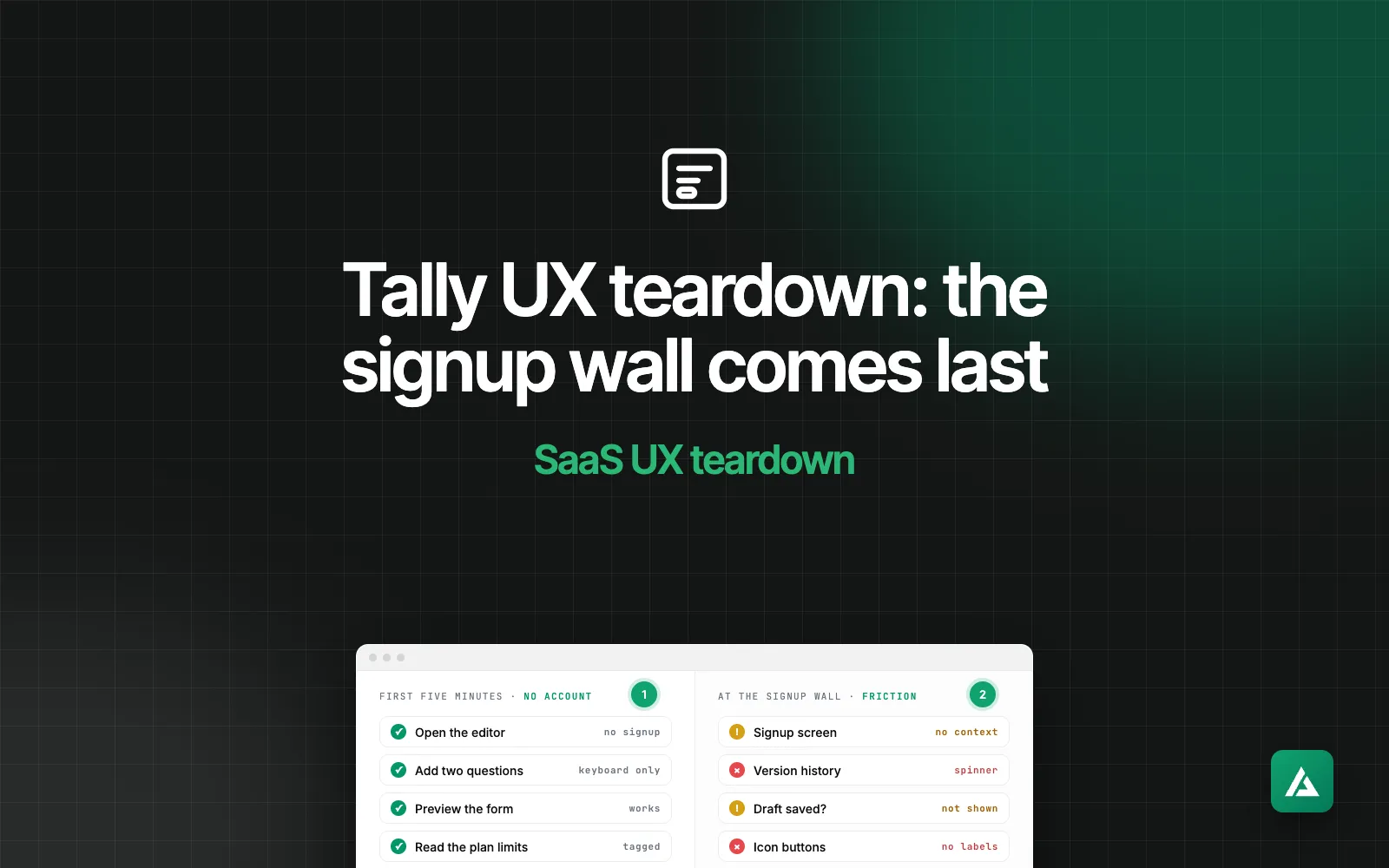
Most SaaS products ask for your email before they show you anything. Tally, a form builder from a small bootstrapped company in Ghent, Belgium, does it the other way round: you build the form first and meet the signup screen last. I went through the first five minutes as a new user, stopped at that screen, and wrote down what works, where it leaks and what I would fix first.
Disclaimer
Independent teardown, no affiliation with Tally. I tested the public site and the editor that opens without an account on 14 November 2026, in desktop Chrome and at a 390-pixel phone width. I did not create an account or publish a form, so everything after the signup screen is outside this teardown. Products change; treat the specifics as a snapshot and the patterns as the point.
The first five minutes, step by step
Here is the whole path: what I did, and what the product did back.
- I clicked "Create a free form" on the home page. The editor opened. No account, no email, no product tour.
- I typed a title and pressed Enter. A Submit button appeared, and the Preview and Publish buttons woke up.
- I typed /. A menu of 37 blocks opened, in four groups. Typing "ema" narrowed it to Email.
- I added an email question and a star rating. Both from the keyboard, with the cursor waiting in the question label each time.
- I clicked Preview. A working form, with the cursor in the first field.
- I opened Integrations and clicked Connect. The signup screen appeared: Google, Apple or email.
I had a working two-question form before the product asked me for anything. The first request for my email came at step 6.
What Tally gets right
1. The wall is at the end, not the start
The button on the home page says "Create a free form", the line under it says "No signup required", and both are true. One click opens the real editor, not a demo or a video. By the time Tally asks for an email, I have a form I made myself. The question is no longer "is this worth an account?" but "do I want to keep this?", and that is a far easier yes.
The lesson for any SaaS: put the signup where an account is needed. Building a form does not need one. Connecting it to Google Sheets does, and that is exactly where Tally asks.
2. An empty state that teaches in two lines
A blank editor is the hardest screen in any builder. Tally's has a title placeholder, four ways to start (from scratch, with AI, from a template, or by importing a form) and two lines of help: the product works like a document, type / for a form block and @ to mention an answer. There is no tour, no checklist and no video. Everything I needed to finish the form was on the screen before I typed a letter.
3. One menu, and the keyboard reaches all of it
Typing / opens every block Tally has: 19 question types, 9 layout blocks, 4 embeds and 5 advanced ones such as conditional logic. A few more letters filter the list, Enter inserts the block, and the cursor lands in the question label. I added an email field and a star rating without touching the mouse. Thirty-seven options would be a wall of icons in a sidebar. In a menu you can type into, they are one habit.
4. Paid features are labelled where they live
The Settings panel opens before signup and shows the whole list, free and paid together. Partial submissions and removing the Tally badge carry a Pro tag; data retention carries a Business tag. I learned where the free plan ends by reading one panel, not by hitting a paywall halfway through a task. The pricing page says the same thing in plain numbers: unlimited forms and submissions are free within fair use, Pro is $29 a month and Business is $89.
Where the friction sits
1. The signup screen forgets what I was doing
I clicked Connect next to Google Sheets and got a screen titled "Create your Tally account", with one general line about creating forms. It does not mention Google Sheets, and it does not mention my form. This is the most important screen in the flow, the one moment Tally asks for something, and it is the only one written for a stranger. There is a "Back to editor" link, which is good. Nothing says my form will still be waiting on the other side.
2. Version history opens on a spinner
The clock icon in the top bar opens a large panel called Version history. For my draft it showed a spinner, an empty list and a blue Restore button, and it was still spinning eight seconds later. The pricing page lists version history under Pro, so the honest state here is "nothing yet" or "this is part of Pro". The Settings panel does this well with its tags. This button does not, and a first-time user cannot tell whether the product is slow, broken or waiting for something.
3. Nothing says the draft is saved, or where
The draft is saved as I type: I reloaded the page and the form came back. It lives in the browser's own storage, not in an account, so it will not follow me to my phone or survive a cleared browser. The editor shows none of this. There is no "saved" mark near the title and no note that the form exists only on this computer. Tally built the safety net and then hid it. The user is left to worry, and a quiet reason to sign up goes unused.
4. Icons without names, and small targets on a phone
Three buttons in the top bar are icons only: Integrations, Version history and Settings. They show a tooltip, but they have no label in the code, so a screen reader has nothing to read out except "button", three times. At a 390-pixel phone width the editor still works and nothing scrolls sideways, which is good. The top bar buttons are 28 pixels tall there, well under the 44 points Apple recommends for touch, and those three icon buttons drop out of the bar.
What I would change first
- Make the signup screen finish my sentence. If I clicked Connect on Google Sheets, say so: "Create an account to connect Google Sheets. Your form comes with you." One line, built from what the product already knows.
- Give Version history a real empty state. Either a Pro tag on the icon, like the ones in Settings, or a sentence in the panel that says when versions start. Never a spinner with a Restore button under it.
- Show the save state. A quiet "Saved in this browser" next to the title, changing to "Saved to your account" after signup. It reassures, and it is the most natural signup prompt the product could have.
- Name the icon buttons. Three labels in the code. It is the cheapest fix on the list.
Takeaways for SaaS founders
- Ask for the account when the product needs one. Find the first thing a new user can make without an account, and let them make it. A signup that protects something they built is an easier ask than one that guards a promise.
- The wall is a screen too, so design it. Say what the account unlocks and what happens to the work so far. A general signup page at the moment of highest interest wastes the moment.
- Every button in a half-finished state needs an answer. Before signup, before data, before payment: each control should work, explain itself, or not be there. A spinner is none of the three.
- Show people what you are doing for them. Autosave that nobody can see earns no trust. One word next to the title would.
Questions founders ask
What is a signup wall?
The point in a product where you must create an account to go further. Every SaaS has one. The design question is where it stands: before the first click, or after the user has seen the product work.
Should my SaaS let people try the product before signing up?
If the first useful result needs no stored data, yes. Builders, editors, calculators and generators can all run in the browser first. Products that depend on the user's own data, such as a CRM or an analytics tool, usually cannot, and a demo workspace with sample data is the next best thing.
How do I find friction like this in my own onboarding?
Go through it as a stranger: a new browser profile, a new email address and no shortcuts. Click every button on the way, including the ones you would never click yourself. Write down each moment you had to stop and think.
If you want the same review of your own product, with a ranked fix list and Figma fixes for the top issues, that is my SaaS UX audit. The sample UX audit report shows the format, and my SaaS UX audit checklist starts with onboarding and the first run. The first teardown in this series looked at Pipedrive.
Sources
- Tally, home page and the editor that opens without an account
- Tally, plans and prices, monthly billing
- Tally, about the team
Checked on 14 November 2026. If there is a European product you want torn down next, tell me.