ZoApps
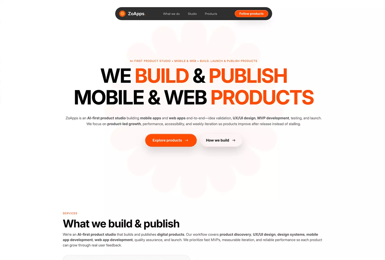
An AI-first product studio building and publishing mobile and web apps. The work focuses on product-first UX/UI systems, reusable design components, and rapid iteration based on real usage data.
Product-first UX that scales
The goal was simple: build interfaces that feel clear on day one and stay consistent as the product grows. This meant establishing navigation patterns, component rules, accessibility-friendly contrast, and a clean UI language that supports fast iteration across mobile and web platforms.
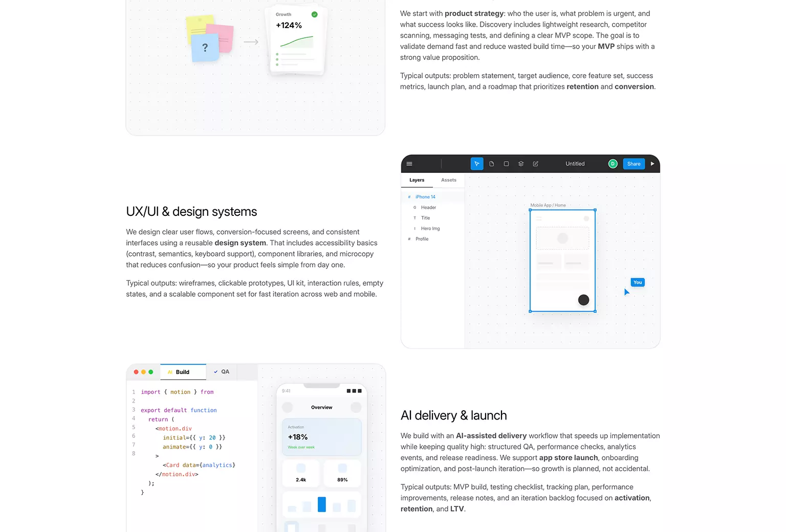
Built for speed and consistency
ZoApps uses a reusable component system so screens can be assembled quickly without sacrificing quality. Clear rules for icons, spacing, and interaction states reduce design debt, improve developer handoff, and keep the experience consistent across every feature and app in the studio's portfolio.
Clarity, accessibility, and clean layout
Forms, typography, and inputs were tuned for clarity: readable type scales, consistent spacing, and accessible states. Buttons and CTAs were designed to support onboarding and retention with clear hierarchy, predictable behavior, and reusable variants keeping products launch-ready while flexible enough to evolve.
Built for speed and consistency
ZoApps uses a reusable component system so screens can be assembled quickly without sacrificing quality. Clear rules for icons, spacing, and interaction states reduce design debt, improve developer handoff, and keep the experience consistent across every feature and app in the studio's portfolio.
Need a product-first UX/UI system?
Book a free 20–30 minute call to discuss your product, design system, or MVP build.